
You are running cold email campaigns, tracking open rates and reply rates, and reporting pipeline back to leadership.
But none of those numbers hold up if your emails are not landing in the inbox.
This guide walks through 21 email deliverability benchmarks worth measuring against in 2026. I also tie each metric back to pipeline so the numbers actually mean something.
Let's get into it.
Here is the snapshot you can screenshot and paste into your team doc.
For each benchmark below, I explain what the number means, why it is helpful, and what to do if you are sitting below it.
This is the anchor metric for the entire email world. According to the Validity 2026 benchmark report, roughly 15% of emails miss the inbox entirely.
That means one in six of your cold emails is invisible to the prospect on the other end.
Inbox placement is different from delivery rate. Delivery rate is the percentage of emails that did not bounce, and it sits at 98 to 99% globally.
Inbox placement is the percentage of delivered emails that actually landed in the primary inbox. The gap between the two is where money leaks.
Why this stat is helpful is that it gives you a floor. If your inbox placement drops below 83%, you are underperforming the global average.
If you are hitting 88 to 90%, you are ahead of most senders. And if you are north of 93%, you are in top-performer territory.
The reason the benchmark hovers at 83 to 85% is not random. Mailbox providers have tightened filtering steadily since 2023, with Gmail and Yahoo rolling out stricter sender requirements in February 2024.
Those rules pushed the average down for senders who did not adjust. The ones who kept pace with authentication, list hygiene, and volume control held on to their placement rates.
If your placement is sitting under 83%, the fix usually comes down to three things:
Any one of those three will drag your placement down. It is common to have all three happening at once without realizing it.
My guide on proven ways to improve cold email deliverability rates walks through the diagnostic sequence in more detail.
Delivery rate looks impressive because it almost always is. Modern ESPs and infrastructure providers filter out most invalid addresses before send.
So 99% delivery is common across the board.
Here is the trap, though. A 99% delivery rate does not mean 99% of your emails reached the inbox.
It just means 99% did not bounce. The rest could still be sitting in spam, promotions, or a filtering black hole.
Why the stat is still helpful is that a sudden drop is meaningful. If your delivery rate slips from 99% to 95% inside a week, that is a red flag.
That kind of dip signals list rot or a domain reputation issue that is escalating fast. It will show up on inbox placement within days.
Here is what usually causes a delivery rate drop:
All three cause hard bounces to spike, which is what pulls delivery rate down.
If your delivery rate slips, pause the campaign first. Do not keep sending into the drop.
Then run a bounce audit, remove every hard bounce from the list, and check your domain against major blacklists like Spamhaus and Barracuda.
According to the Unspam benchmark data, 4% of sending IPs and 0.3% of domains sit on at least one blacklist at any given time.
A single listing can tank your inbox rate for weeks before you notice.
Around 15% of emails globally get flagged as spam by mailbox providers. That is roughly one in seven messages you send.
It is the single biggest gap between what you sent and what actually got read.
Why this stat is helpful is that it forces you to think about pre-send hygiene. Spam classification is not random.
It is a scoring system that weighs authentication, sender reputation, content signals, engagement history, and the reputation of the domains you link to inside the email.
The trend has been getting worse, not better. Between 2023 and 2026, spam folder rates crept up as mailbox providers added more aggressive filtering to fight AI-generated spam and phishing.
That means the bar for looking legitimate has moved up too. What passed as a clean cold email in 2022 might land in spam today.
If you are pushing past a 15% spam rate, here are the three levers to pull in order:
You can usually pull your spam rate back into single digits within a few sends by fixing content alone. The deeper fix, though, is reputation.
If your sender reputation is already low, even a well-written email will hit spam. That is where a longer-term rebuild comes in, and where continuous warmup and monitoring matter.
The top 25% of senders hit 93% or higher inbox placement, according to the Validity 2026 report. That gap between average (83 to 85%) and top performer (93%+) is roughly 8 to 10 percentage points.
Here is why the number matters. Every point of inbox placement is a point of pipeline.
A 10-point swing on a 10,000-send campaign is 1,000 more prospects actually seeing your email. Multiply that across three months of campaigns and you are talking about tens of thousands of missed touchpoints.
The senders who hit the 93% mark tend to share five habits:
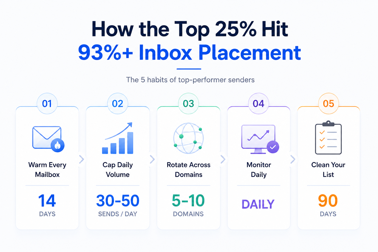
None of these are secret tactics. They are just consistent, and consistency is the actual moat.
The complaint rate is the percentage of recipients who mark your email as spam. Anything above 0.1% is a warning sign.
Anything above 0.3% will get you enforcement action from Gmail and Yahoo, according to their 2024 sender requirements update.
Why this stat is helpful is that it is the fastest way for mailbox providers to judge you. Complaint rate signals to Gmail and Outlook that your recipients do not want your emails.
They respond by throttling or blocking future sends. Unlike bounce rate, which reflects list quality, complaint rate reflects targeting quality.
It answers a specific question: are you emailing people who actually want to hear from you?
The 0.1% threshold is deceptively strict. If you send 10,000 emails, that is only 10 complaints before you cross the line.
Once you cross it, recovery takes weeks of clean sending to reset. Cross it multiple times and your domain reputation can drop to a level where reaching the inbox becomes nearly impossible.
If your rate is climbing past 0.1%, here are the three fixes in order:
Revisit how domain reputation impacts cold email success to understand what happens after complaints stack up on your record.
Hard bounces are permanent delivery failures. They usually mean the address does not exist, the domain is invalid, or the mailbox has been shut down.
The 2% threshold is what mailbox providers use to decide whether you are a legitimate sender or a spammer scraping bad lists.
Why the stat is helpful is that bounce rate is the earliest warning sign of list decay. Every hard bounce chips at your domain reputation.
Once your reputation drops, inbox placement follows within days. A campaign with a 5% bounce rate is not just wasting sends. It is actively damaging your ability to reach the addresses that are valid.
Here is the pattern I see across teams that hit 2%+ bounce rates. They pulled a lead list from a database six months ago and are running it again without re-verifying.
In that six-month gap, roughly 20 to 30% of B2B email addresses churn. People change jobs, companies restructure, mailboxes get deprecated.
What was a clean list in January is a decayed list by July.
If your bounce rate is trending up, here are the three fixes:
My guide on cold email domain best practices for scaling covers list decay and domain protection in depth.
SPF stands for Sender Policy Framework. It tells mailbox providers which IP addresses are authorized to send emails from your domain.
Adoption is at 90% globally, according to the Unspam benchmark.
Why the stat is helpful is that it sets a floor. If you are not in that 90%, you are already flagged as suspicious by default.
Publishing an SPF record is one of the simplest deliverability wins available. It takes ten minutes to configure and immediately improves how mailbox providers view your domain.
If you have not set up SPF, here are the three steps to fix it:
If you are running Mailforge, SPF is configured automatically as part of your DNS setup. So this step gets handled for you the moment your domains are provisioned.
DKIM stands for DomainKeys Identified Mail. It adds a cryptographic signature to every email you send.
That signature proves the email was not tampered with in transit and confirms it came from an authorized sender. Adoption is at 88%, per Unspam.
Why the stat is helpful is that DKIM is a trust signal, not a filter. Mailbox providers use it to verify that the sender is who they claim to be.
Without DKIM, your emails look like they could be forged. Even legitimate cold outreach gets treated with suspicion.
Setting up DKIM is slightly more technical than SPF but still straightforward:
If DKIM alignment is broken, no amount of warmup will fix your placement. Alignment matters as much as adoption.
DMARC ties SPF and DKIM together. It tells mailbox providers what to do when an email fails either check, whether to let it through, quarantine it, or reject it outright.
Adoption sits at just 56% globally, which is where most senders get burned.
Why the DMARC gap matters so much: Gmail and Yahoo now require DMARC for bulk senders, meaning anyone sending more than 5,000 messages per day across the domain. If you are cold emailing at scale without DMARC, you are already behind the enforcement curve.
Mailbox providers are treating your emails with suspicion by default.
Setting up DMARC properly involves three stages:
Full authentication (SPF, DKIM, and DMARC) is set up automatically for every domain when you provision through Mailforge, so you skip the manual DNS configuration entirely.
BIMI stands for Brand Indicators for Message Identification. It lets your logo appear next to your emails in supported inboxes like Gmail, Apple Mail on iOS 16 and above, and partial support in Outlook.
Only 0.98% of domains currently publish a valid BIMI record, per the Unspam data.
Why the stat is helpful even though adoption is low: BIMI-verified brands see a 25% lift in brand recognition and an 18% lift in open rates. It is a competitive edge, not a requirement.
For cold outreach specifically, BIMI is less critical. Cold emails typically come from individual sender names, not brand logos, so the visual lift matters less.
BIMI also requires three investments most cold senders skip:
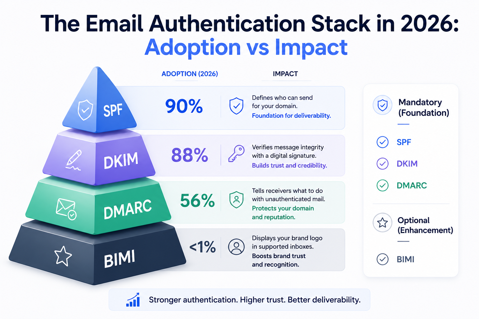
Enterprise brands running high-volume email programs should look at BIMI seriously. Cold outreach teams can park it for later and focus the same investment on domain rotation and warmup infrastructure.
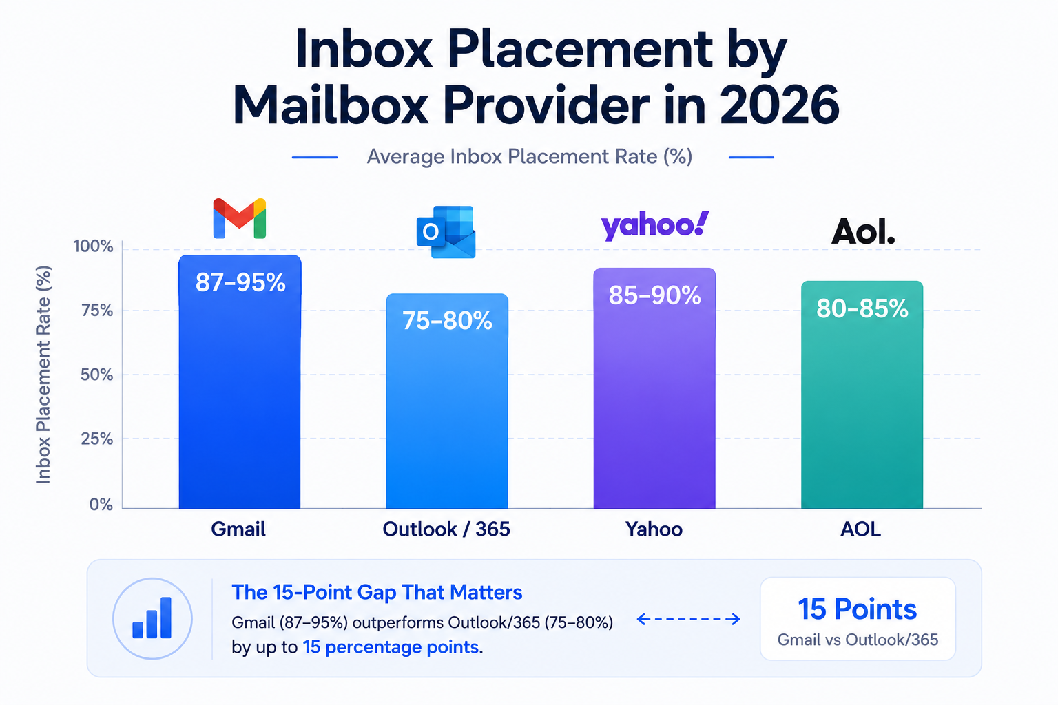
Gmail averages 87 to 95% inbox placement across senders, per the Emailtooltester deliverability test. It is the most forgiving major mailbox provider once your domain is warmed.
Why this stat is helpful is that Gmail's filtering leans heavily on engagement signals. Once your domain has been warmed and you have built positive engagement history, Gmail tends to trust you.
Subsequent emails get through with less scrutiny. New domains get flagged early, but the recovery curve is faster than on Microsoft.
If you have a warmed Gmail-hosted sending domain and clean list hygiene, hitting 90%+ inbox placement is realistic.
Here is what drives strong Gmail placement:
If your Gmail placement is under 87%, the issue is usually warmup or engagement. Fix those and the number climbs quickly.
Outlook and Microsoft 365 frequently fall to 75 to 80% inbox placement, per Emailtooltester data. That is 15 percentage points lower than Gmail on average.
Why the stat is helpful is that it changes your cold outreach strategy entirely. If your ICP skews toward Microsoft-hosted addresses, Gmail-tuned tactics will not save you.
Microsoft's filtering is reputation-based, not engagement-based. It penalizes new domains harder, weighs sending patterns more strictly, and reacts faster to complaint spikes.
Microsoft 365 also uses a filtering layer called SmartScreen that behaves differently from Outlook.com. So even the same recipient can get filtered differently depending on whether they are on a personal Outlook account or a corporate 365 tenant.
To improve Microsoft placement, focus on three things:
Real Microsoft 365 mailboxes matter more than repurposed alternatives here. Loopholes and EDU tricks that work on Gmail get flagged fast by Microsoft.
Yahoo lands at 85 to 90% inbox placement, closer to Gmail than to Microsoft. Yahoo tightened its filtering alongside Gmail as part of the February 2024 sender requirements update.
Why the stat is helpful is that Yahoo represents a smaller but still meaningful share of B2B inboxes. It also serves as an early warning system.
If your Yahoo placement drops before your Gmail placement, that is a signal your reputation is slipping in ways Gmail has not caught yet.
The fixes for Yahoo placement are the same as Gmail:
If Yahoo is your outlier ISP, treat it as diagnostic information. It usually means something in your sending pattern is off.
AOL sits at 80 to 85% inbox placement, per Emailtooltester data. It is a smaller share of enterprise inboxes, but AOL uses similar filtering to Yahoo since both are owned by the same parent company.
Why the stat is helpful is that AOL often shows deliverability issues before they hit the larger mailbox providers. A drop in AOL placement is worth investigating even if your Gmail and Outlook numbers look fine.
For most B2B cold outreach, AOL is a minor mailbox. But if your ICP includes older prospects or specific industries where AOL is still used, it matters.
The fixes are consistent with Yahoo:
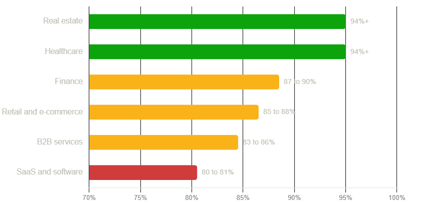
Real estate consistently tops the placement charts at 94% and above, per the Validity 2026 report. It is the industry benchmark that sets the ceiling.
Why the stat is helpful is that it shows what is possible when sending patterns look natural to mailbox providers. Real estate agents send lower-volume, highly personalized emails to clients they already have relationships with.
That pattern produces the engagement mailbox providers reward.
The takeaway for other industries is that personalization and volume discipline matter more than any single tactic. If you can mimic the real estate sending pattern with your own outbound, your placement climbs.
Healthcare matches real estate at 94% and above, per Validity data. The reasons are slightly different but the outcome is the same.
Why the stat is helpful is that healthcare communications tend to be opted-in, transactional, and low in complaint volume. That combination produces some of the strongest sender reputations in the market.
For cold outreach teams, the healthcare benchmark is aspirational. You will not match it exactly with pure outbound, but the underlying habits are transferable:
Finance lands at 87 to 90% inbox placement, per Validity data. It sits above the global average but below the top-tier industries.
Why the stat is helpful is that finance sits in the middle of the pack, which makes it a realistic target for well-run B2B outbound. If you are in finance or targeting finance buyers, this is where you should be.
The pressure on finance placement comes from three sources:
To hit or exceed the 87 to 90% benchmark, focus on clean copy without heavy legal boilerplate in the visible body. Move disclosures to the footer or link them externally.
Retail and e-commerce sit at 85 to 88% inbox placement. The industry sends high volume with tight promotional content, which pulls placement toward the middle of the pack.
Why the stat is helpful is that retail's placement is being pulled down by promotional language and heavy image-to-text ratios. Both are red flags for spam filters.
If you are running B2B outreach into retail or e-commerce brands, expect strong placement. If you are running B2C promotional email in this space, expect placement pressure.
The three levers that improve retail placement:
B2B services lands at 83 to 86% inbox placement. Right around the global average.
Why the stat is helpful is that B2B services covers most cold outreach territory. If you are running outbound for an agency, consultancy, or professional services firm, this is your benchmark.
The reason B2B services sits at average is volume pressure. B2B outbound is running at higher volumes than ever, and mailbox providers are tuning filters to compensate.
Hitting the top of this range (86%+) requires:
SaaS and software sit at the bottom of industry placement rankings at 80 to 81%, per the Validity 2026 report. It is the toughest category for deliverability.
Why the stat is helpful is that it validates what SaaS founders already suspect. Cold outreach is harder in SaaS than in almost any other industry.
The reasons SaaS placement drags:
If you are in SaaS and hitting 82% placement, you are performing above average for your industry. If you are in SaaS and dropping below 80%, you have work to do.
The fix is discipline, not creativity. Cap volume, rotate domains, and treat your list as if every address costs you money.
My guide on how many cold emails to send daily per domain walks through the safe volumes for SaaS cold outbound.
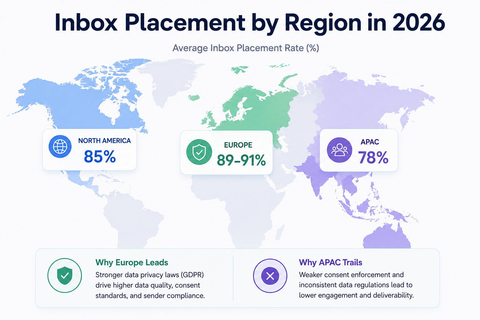
Region matters almost as much as industry. Europe leads at 89 to 91%, North America averages 85%, and APAC trails at 78%, per the Validity 2026 report.
Why the stat is helpful is that region shapes both your sending strategy and your list quality expectations. Same tactics produce different results in different regions.
Europe leads because GDPR forces cleaner, consent-based lists. That legal pressure translates directly into deliverability performance.
When your list is built on legitimate consent, complaint rates stay low, engagement stays high, and mailbox providers reward the pattern with better placement. European senders benefit from the constraint whether they realized they were going to or not.
APAC placement sits lower because consent enforcement is weaker across most markets, spam volume is significantly higher, and mailbox providers in the region tune their filters more aggressively.
If you are sending across regions, here are the three adjustments to make:
Deliverability numbers only matter because they cascade into every downstream metric. Here is the chain, with the math worked out.
Say you send 10,000 cold emails in a month. Your reply rate on inboxed emails runs at 3%, which is the current benchmark for cold outreach (full breakdown here).
Your meeting book rate on replies runs at 20%. Your average deal size is $20,000.
Now compare two scenarios.
Scenario A: Average deliverability at 85% inbox placement
10,000 sends → 8,500 inboxed → 255 replies → 51 meetings → $1,020,000 in pipeline
Scenario B: Below-average deliverability at 70% inbox placement
10,000 sends → 7,000 inboxed → 210 replies → 42 meetings → $840,000 in pipeline
That is a $180,000 pipeline difference from a single 15-point deliverability slip.
Deliverability is not an IT metric. It is a revenue metric, and every point of inbox placement is a point of pipeline.
The compound effect is what makes deliverability so undervalued inside sales orgs. A 15-point drop looks like a small filter tweak to the person watching it.
To the person owning the pipeline number, it is nearly $200,000 gone in a single month. Multiply that across a year and you are looking at a seven-figure revenue gap.
The reverse math also holds. If you improve inbox placement from 85% to 93%, using the same 10,000-send campaign, you go from 51 meetings to 56.
That is an extra $100,000 in monthly pipeline without changing the copy, the list, or the offer. Just the infrastructure and hygiene underneath the send.
This is why the top-performing outbound teams treat deliverability like a first-class metric, not a background one.
Now that you know what the numbers should look like, here is how to check where you stand today. Follow these five steps in order.
Send a test email through your sending tool to a seed list of 30 to 50 addresses spread across Gmail, Outlook, Yahoo, and Microsoft 365. Track how many landed in inbox, promotions, or spam.
Free tools like Mail-tester and GlockApps give you a starting benchmark, and both let you break out placement by ISP so you can see where the drops are concentrated. Run the test on a fresh subject line and body that matches your actual campaign, not a generic test message.
Content weight affects the score, so the closer your test is to your real send, the more accurate the read.
Run a FREE INBOX PLACEMENT TEST HERE
Verify your SPF, DKIM, and DMARC records are configured correctly and, more importantly, aligned. Broken alignment is one of the most common silent killers of deliverability.
Free tools like MXToolbox let you check each record and confirm it is publishing correctly. Also pull a recent email you sent and inspect the raw headers to confirm the SPF and DKIM domains match the visible sender domain.
If they do not, you have an alignment issue that no amount of warmup will fix.
Point-in-time tests miss trends. You need continuous monitoring across every mailbox in your rotation, tracking heat scores daily so drops get caught in days rather than months.
A heat score of 85 or higher indicates a healthy mailbox ready to send at scale. Anything below 70 is a warning sign that reputation is slipping.
This is where a warmup and deliverability center like Warmforge earns its keep, tracking placement, complaint rates, and authentication health across your entire mailbox fleet in one view.
Aggregate placement hides problems. If your Gmail placement is 92% but your Microsoft 365 placement is 65%, the average of 78% will not tell you where to fix.
Segment first, then act. Look at placement rates broken out by mailbox provider, then by domain age, then by mailbox individually.
The problem is almost always concentrated, not evenly spread. Fixing the two or three domains dragging the average is usually a bigger lift than trying to boost every mailbox at once.
The fastest way to improve deliverability without touching infrastructure is to clean your list. Run every address through a verification tool. Remove hard bounces.
Cut anyone who has not engaged in the last 90 days. If your list is more than 90 days old, re-verify before you send.
This one step tends to move placement rates by 3 to 5 points on its own, and it costs less than any other lever.
Once you know your baseline, you can pick the right sending tool for your setup. Salesforge handles the sending layer and pulls placement data into a single view, which makes the segmentation piece easier.
If your numbers are below benchmark, here is the playbook. These are the levers I pull in order, from fastest to most infrastructure-heavy.
Bad data is the root cause behind almost every deliverability problem. Verify every address, remove hard bounces immediately, and cut anyone who has not engaged in 90 days.
This is the fastest lever and usually the highest-impact one. A single list cleanup can move your inbox placement by 3 to 5 points inside a week.
Fourteen days of warmup is the minimum. Skipping it is why so many new senders sit at 60% placement in month one.
Warmup builds sender reputation gradually by simulating human-like inbox interactions. That teaches mailbox providers your domain is legitimate.
Without warmup, you are asking Gmail and Outlook to trust an unknown domain that suddenly started sending business email. Their default answer is filtering.
30 to 50 sends per mailbox per day is the safe zone for cold outreach in 2026. Push past that and mailbox providers start throttling.
This is why domain and mailbox rotation matters. Instead of hammering one mailbox with 500 sends a day, spread the same volume across 10 to 15 mailboxes at 30 to 50 sends each.
The total volume stays the same, but the pattern looks natural.
A single domain sending 500 emails a day looks like spam. Ten domains sending 50 each looks like a normal business.
This is not a hack. It is how legitimate outbound programs have always run, and mailbox providers have tuned their filters around expected volume distributions per domain.
Running a rotation of 5 to 20 domains, each with 3 to 5 mailboxes, is the standard for cold outreach at scale.
Shared IP infrastructure works for most cold senders because it is affordable, fast to set up, and gives you good baseline deliverability. Dedicated IPs make sense once you are sending north of 3,000 emails per day.
Below that volume, dedicated IPs actually hurt because you do not have enough sending signal to build a strong reputation on the IP. I break down the tradeoffs in my guide on email infrastructure providers.
The teams that hit 93% placement are not doing anything magic. They are just catching drops early and fixing them before they compound.
Set up daily monitoring on heat scores and placement rates. Set up alerts for complaint rate spikes or bounce rate increases.
Treat deliverability like a monitored metric, not an occasional audit, and you will operate above the average consistently.
Every number in this guide traces back to one thing: whether your emails reach the inbox. If they do, your pipeline math works. If they do not, no amount of clever copy will save the campaign.
Get the infrastructure right first. Cold email deliverability starts with the domains, the mailboxes, the authentication, and the warmup.
That is the foundation everything else sits on. Content, targeting, and sequence design matter, but they matter downstream of infrastructure.
Fix infrastructure, and every other lever you pull gets multiplied.
If you want infrastructure that clears these benchmarks from day one, Mailforge sets up domains, mailboxes, and DNS in under 10 minutes. So you can start sending against these numbers instead of chasing them.
A good inbox placement rate is 85% or higher. Top performers hit 93% and above. Anything below 83% is underperforming the global average and needs a fix.
Delivery rate is the percentage of emails that did not bounce, usually 98 to 99%. Inbox placement is the percentage of delivered emails that actually reached the primary inbox, which averages 83 to 85% globally. Delivery rate is a technical metric. Inbox placement is a business metric.
Below 0.1%. Google and Yahoo enforce a hard cap of 0.3%, above which they will throttle or block your sends. Below 0.05% is where top performers sit.
Gmail and Microsoft 365 use different filtering algorithms. Gmail is more forgiving on well-warmed domains and leans on engagement signals. Microsoft 365 is stricter, penalizes new domains harder, and reacts faster to complaint spikes. Cold outreach into Microsoft-heavy audiences requires more careful warmup and volume management.
At minimum, once a week for active campaigns. Ideally, use a continuous monitoring tool that tracks heat scores and inbox placement daily so you catch drops before they compound.
A heat score of 85 or higher indicates a healthy mailbox that is ready to send at scale. New mailboxes should not send cold campaigns until they hit that mark, which usually takes around 14 days of warmup.
Invalid email addresses, deactivated mailboxes, and stale data from old lead lists. Running every address through an email verifier before adding it to a sequence keeps bounce rate under 2%. Re-verifying lists older than 90 days keeps it under 1%.
Not much in 2026. BIMI is more valuable for brand-heavy transactional and marketing email than cold outbound. The investment in a Verified Mark Certificate is usually better spent on domain rotation and warmup infrastructure for cold senders.